6 Mobile First Indexing Fixes to Hand Developers

Google uses the mobile version of your site as the primary source for indexing and ranking, full stop. If content, links, or structured data exist only on desktop, they may as well not exist at all. The first move for any team: check Search Console’s indexing status, run a URL inspection on your top revenue pages, and confirm mobile and desktop show identical content.
TL;DR:
- Mobile-only content, resources, and structured data are essential for SEO success, as Google indexes the mobile version as the primary source.
- Sites using separate mobile URLs or dynamic serving must ensure content parity and correct resource blocking to prevent indexing issues.
- Performance optimization, proper usability standards, and correct schema markup are critical to maintaining good mobile rankings under mobile-first indexing.
- Regular audits using Google Search Console, PageSpeed Insights, and Chrome DevTools help identify and fix mobile indexing gaps continuously.
- Ongoing collaboration between developers and SEOs is necessary to sustain and improve mobile indexing health, especially after launch or redesign.
Table of Contents
- What Is Mobile-First Indexing, and Is It Fully Rolled Out?
- How Does Mobile-First Indexing Change SEO Outcomes?
- Mobile-First Indexing Best Practices for Developers and SEOs
- What Causes Most Mobile-First Indexing Errors?
- How Do You Test Whether a Site Is Mobile-First Ready?
- Building a Mobile-First Launch and Monitoring Checklist
- How Proxiumdigital Fixes Mobile-First Problems for Clients
- What Teams Get Wrong About Mobile-First Priorities
- Get Your Mobile-First Audit Handled End to End
- Where to Verify These Standards Yourself
- Sources
- FAQ
What Is Mobile-First Indexing, and Is It Fully Rolled Out?
Mobile-first indexing means Googlebot Smartphone, not a desktop crawler, generates the version of your pages that Google indexes and ranks. Google renders the mobile HTML, evaluates the mobile content, and reads mobile structured data as the record of truth for your site.
The transition is not a future event you need to prepare for. It has been completed since 2020, when Google finished moving the entire web to mobile-first crawling and indexing. Every new site launched today gets indexed this way by default. If your analytics still show meaningful desktop-agent crawl activity dominating your logs, something is misconfigured, not merely old-fashioned.
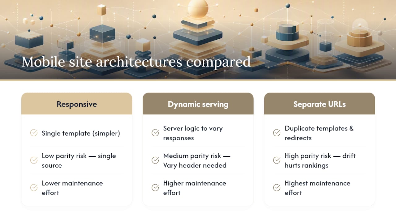
Three architectural paths existed historically: responsive design (one URL, one template, fluid layout), dynamic serving (same URL, different HTML by user agent), and separate mobile URLs (an m.example.com subdomain). Google has recommended responsive design as the default for years, and mobile-first indexing sharpened that preference into something close to a requirement. Dynamic serving and separate mobile domains both require constant upkeep to keep content, links, and metadata in sync, and both introduce failure points that responsive sites simply don’t have.
How Does Mobile-First Indexing Change SEO Outcomes?
The mechanics are simple, but the consequences ripple through nearly every ranking factor you track. Once Googlebot Smartphone becomes the primary crawler, anything you hide from mobile visitors, intentionally or not, gets treated as if it doesn’t exist for ranking purposes.
Content parity is the biggest lever here. A common pattern on older responsive builds: developers collapse an FAQ block, hide a secondary navigation menu, or strip an author bio behind a “read more” toggle on mobile to save screen space. If that content loads only on interaction or gets removed from the mobile DOM entirely, it’s invisible to the index, even though it displays fine on desktop.
Core Web Vitals compound the problem. Google measures LCP, INP, and CLS on mobile devices and mobile network conditions, not desktop broadband. A site that scores well on a fiber connection with a quad-core desktop CPU can fail badly on a mid-range Android phone over 4G, and that gap shows up directly in ranking signals.
Crawl behavior shifts too. Once a domain is fully on mobile-first indexing, the smartphone agent does the overwhelming majority of crawling and rendering. Any resource, script, or stylesheet that renders fine to a desktop crawler but chokes on the mobile rendering path effectively breaks your indexing pipeline.
There’s also an indirect signal worth taking seriously: poor mobile usability drives pogo-sticking, where users tap a result, hit a broken layout or unreadable text, and bounce straight back to the results page. That’s not a documented ranking factor on its own, but it shapes the click and engagement patterns Google’s systems do weigh.
Mobile-First Indexing Best Practices for Developers and SEOs
Fixing mobile-first issues comes down to six priorities, roughly in the order you should tackle them.
Choose responsive design and stay there. If you’re still running a separate mobile subdomain, migrating to responsive should be at the top of your roadmap. Separate URLs mean maintaining duplicate templates, duplicate redirects, and duplicate structured data, and any drift between the two versions creates exactly the parity gap that hurts rankings. If a legacy setup forces you to keep dynamic serving in the short term, make sure your server sends a Vary: User-Agent header so caches and crawlers correctly distinguish the mobile and desktop responses.
Lock down content parity. Every heading, paragraph, image, internal link, and piece of schema markup that exists on desktop needs to exist on mobile. That includes metadata: title tags, meta descriptions, and canonical tags must match across breakpoints, not just the visible page copy.
Unblock the resources Googlebot needs to render the page. Check your robots.txt file for accidental disallow rules on /css/, /js/, or image directories. Googlebot Smartphone renders pages the way a real browser would, and a blocked stylesheet can make a perfectly good layout look broken or incomplete during rendering, which affects how content gets indexed.
Cut the performance cost. Serve images in WebP or AVIF, lazy-load anything below the fold, and never lazy-load content that should be visible or crawlable on page load. Trim JavaScript execution time aggressively. Every unnecessary script adds render delay on mobile hardware, where CPUs are a fraction as powerful as a desktop chip.

Follow the physical usability standards. Tap targets need at least 48x48 CSS pixels of touch area, body text should sit at a 16px minimum, and your viewport meta tag should never disable user scaling with maximum-scale=1 or user-scalable=no.
Recheck structured data and canonicals on the mobile render. Schema markup that only appears in your desktop template silently disappears from Google’s understanding of the page once mobile-first indexing takes over.
Pro Tip: Don’t just eyeball your mobile pages in a browser resized to phone width. Use Chrome DevTools’ device emulation with CPU throttling set to 4x slowdown. That’s a much closer approximation of what a mid-range Android phone actually experiences, and it will expose layout shifts and slow scripts a resized desktop window never shows you.
What Causes Most Mobile-First Indexing Errors?
Google’s own error categories for mobile-first indexing problems repeat across nearly every audit Proxiumdigital runs. Here’s how to find and fix each one.
-
Missing or mismatched structured data. Pull your mobile URL through Google’s Rich Results Test and compare the schema output against the desktop version. Any JSON-LD block that only fires on desktop templates needs to be duplicated into the mobile template, not conditionally loaded.
-
Accidental noindex or robots blocks on mobile. Some CMS platforms apply different meta robots tags per device template. Inspect the raw mobile HTML source, not just the rendered page, and search for stray
noindexornofollowtags that never made it to the desktop version’s review. -
Blocked images and resources. Audit robots.txt line by line for wildcard disallow rules that catch image folders or CDN paths. Confirm that image URLs referenced in mobile templates resolve with a 200 status and aren’t silently redirecting.
-
Broken redirects and duplicate mobile targets. If you’re migrating away from a separate mobile subdomain, verify every old m.example.com URL 301-redirects to its correct responsive equivalent, and that canonical tags point to the live URL, not a legacy mobile path.
-
Stripped-down page quality on mobile. Intrusive interstitials, ad layouts that push content below the fold, or missing heading structure all count against page quality. Google’s Better Ads Standards flag several ad patterns specifically because they degrade the mobile experience.
How Do You Test Whether a Site Is Mobile-First Ready?
Four tools cover nearly everything you need, and each one shows you something the others don’t.
- Google Search Console is the source of truth. Use URL Inspection to see exactly what Googlebot Smartphone crawled and rendered for a given page, check the Mobile Usability report for tap-target and viewport errors, and read any messages flagging indexing coverage issues.
- PageSpeed Insights, run on the mobile tab specifically, breaks down LCP, INP, and CLS with field data where available. Treat the “Opportunities” section as your remediation punch list, not just a score to chase.
- The Mobile-Friendly Test gives a fast pass/fail read plus a rendered screenshot, useful for catching obvious viewport or content-overlap problems before you dig deeper.
- Chrome DevTools and Lighthouse let you emulate a mobile device, throttle CPU and network, and profile exactly which script is blocking your main thread.
Server logs round it out. Filter for the Googlebot Smartphone user agent and confirm it’s crawling your key pages at a healthy frequency, not getting stuck on a redirect chain or timing out on slow resources.
Building a Mobile-First Launch and Monitoring Checklist
Handing this off to a dev team works best as a sequence, not a wish list.
- Confirm the viewport meta tag is present and correctly configured on every template.
- Audit every responsive template for content parity against its desktop counterpart, including hidden accordions and toggled sections.
- List every resource path that needs to stay unblocked in robots.txt, and hand that list to whoever owns the server config.
- Document required structured data per page type so it ships identically across breakpoints.
- Set a monitoring cadence: weekly Search Console checks, biweekly Core Web Vitals review, and a fresh crawl after any template change.
- Define a rollback trigger. If mobile rankings or indexed page counts drop within two weeks of a launch, revert the change and re-audit before trying again.
Pro Tip: Keep a plain-text changelog of every template edit tied to mobile rendering. When a ranking drop shows up three weeks later, that log is the fastest way to isolate which deploy caused it.
How Proxiumdigital Fixes Mobile-First Problems for Clients
Proxiumdigital builds sites with SEO baked in from the first wireframe, which is the whole point of pairing design and technical SEO under one workflow instead of splitting them across vendors who never talk to each other. That approach heads off the parity gaps this article covers, because there’s no second team retrofitting schema and content onto a design built without them in mind.
The typical remediation path for an existing site: a technical audit that surfaces indexing and rendering gaps, fixes to blocked resources and mismatched markup, performance tuning against mobile Core Web Vitals, then ongoing monitoring. Clients get monthly reporting tracking indexed page counts, Core Web Vitals trends, and mobile visibility, so the fix isn’t a one-time event that quietly decays.
What Teams Get Wrong About Mobile-First Priorities
Most teams treat mobile-first indexing as a technical checklist to clear once and forget. It isn’t. It’s an ongoing constraint on every content and design decision you make going forward, because any future template change can quietly reintroduce a parity gap.
If I had to pick one place to start, it’s revenue pages, not the homepage. Fix content parity and Core Web Vitals on the pages that actually convert first, because that’s where an indexing gap costs the most. Performance work on a blog archive can wait.
Sometimes restoring indexability means accepting a rougher mobile layout for a few weeks while a proper fix ships. That trade-off beats leaving pages unindexed. And the split in responsibility should be clear from day one: developers own resource access and rendering performance, SEOs own content parity and structured data verification. Blurring that line is how parity gaps slip through in the first place.
— Bryan
Get Your Mobile-First Audit Handled End to End
Proxiumdigital fixes mobile-first indexing problems the way they should be fixed: once, correctly, by a team that builds the site and manages its SEO under one roof, so parity gaps never get the chance to open up between departments that don’t talk.

An engagement starts with a technical SEO audit that flags exactly which pages have parity gaps, blocked resources, or Core Web Vitals failures, then moves into remediation and a reporting cadence that tracks indexed pages and mobile performance month over month. If your site was built by one vendor and handed to another for SEO, this is the fix for that fracture, not just a one-off cleanup. Explore Proxiumdigital’s SEO optimization services to see what an audit covers, check current pricing for Metro Detroit projects, or reach out to get your site’s mobile-first status reviewed this week.
Where to Verify These Standards Yourself
- Google’s mobile-first indexing best practices covers content parity, structured data, and resource crawlability in full.
- Google’s 2020 announcement on completing the mobile-first rollout for the whole web.
- Digital.gov’s tap target guidelines for the 48x48 pixel and font-size standards referenced above.
- MDN’s documentation on the Vary header for teams still running dynamic serving.
- Better Ads Standards for the ad layout patterns that hurt mobile page quality.
- Proxiumdigital’s guide on common web design mistakes that hurt rankings and its plain-English technical SEO primer for background on canonical tags and robots.txt.
Sources
FAQ
Is Mobile-First Indexing Still Rolling Out in 2026?
No. Google completed the transition to mobile-first indexing for the entire web years ago; every site indexed today uses Googlebot Smartphone as the default crawler.
Does Mobile-First Indexing Mean Desktop Content No Longer Matters?
Desktop content still matters for desktop visitors, but Google indexes and ranks pages based on the mobile version. If content only exists on desktop, it’s effectively invisible to search.
How Do I Check If My Site Has Mobile-First Indexing Issues?
Run URL Inspection in Google Search Console on your key pages and compare the rendered mobile HTML against your desktop version, then confirm structured data and metadata match.
Are Separate Mobile URLs Still Acceptable?
They work, but they carry ongoing risk. Responsive design avoids the duplicate maintenance and parity errors that separate mobile subdomains routinely introduce.
Can Proxiumdigital Fix an Existing Mobile-First Indexing Problem?
Yes. Proxiumdigital runs a technical audit to identify parity gaps and blocked resources, then handles remediation and ongoing monitoring through its SEO optimization services.